
Gloria Dei Lutheran Church Logo Design
Project Type
Brand Identity
Graphic Design
Date Implemented
June 2025
Project Type
Brand Identity/Graphic Design
Date Launched
June 2025
Campaign Overview
When I first interviewed for my role at Gloria Dei Lutheran Church, I noticed the church didn’t have a clear or consistent logo. Wanting to make a strong first impression — and recognizing an opportunity — I developed a simple, versatile logo concept to share during my interview. The design was enthusiastically received by leadership and has since been adopted as the official logo of the church.
Goals & Design Priorities
Each August, preschool teachers return to the building to prepare for the upcoming school year. We wanted to create a memorable experience that made them feel genuinely appreciated and energized for the year ahead.
Role:
- Concepted and designed the logo independently.
- Presented it to leadership during my interview process.
- Refined and prepared final files for use across platforms.
Goals:
- Create a clean, modern, and versatile logo that would work across print, digital, and signage.
- Reflect the welcoming, faith-centered identity of the congregation.
- Ensure the design was easily adaptable for future branding needs (social media, bulletins, banners, etc.).
Goals:
- Inspiration: (e.g., traditional Lutheran symbolism, simplicity for clarity, local context)
- Typography: Why you chose a particular typeface
- Color Palette: How it reflects the church’s tone and feel
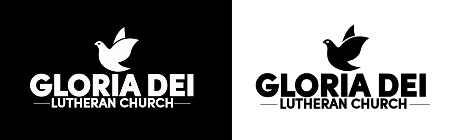
- Symbolism: In Christian symbolism, the dove represents the Holy Spirit, peace, and God’s presence. Its image is deeply rooted in Scripture — most notably in the Gospel accounts of Jesus’ baptism, where “the Spirit descended like a dove” (Matthew 3:16). Within the Evangelical Lutheran Church in America (ELCA), the dove is often used to signify the active presence of the Holy Spirit in the life of the Church. It reflects themes of renewal, comfort, and guidance, all central to Lutheran theology. For Gloria Dei, the dove also speaks to the congregation’s identity: a welcoming, Spirit-led community that seeks to share Christ’s peace with the world. As part of the new visual identity, the dove serves as both a recognizable Christian symbol and a timeless design element that communicates openness, hope, and unity.
Outcome & Impact
- The design has been officially adopted and is now used across all communications — newsletters, signage, website, social media, and printed materials.
- The logo has given the church a consistent, professional identity, helping strengthen recognition within the congregation and the wider community.
- Leadership appreciated the initiative, and it set the tone for my role as someone who can proactively solve communications gaps.